Sunday, 27 November 2011

Composition

Just like the post about light, in this post I will look at 3 images from various artists and look at the composition.
Composition can really enhance artworks, and these pieces of art here are all brilliant!

Jason Chan 

This artwork of Jason Chan (which I could not find the name of) is using the L composition. The characters are frames at the right section of the image and with the space on the left side it is very pleasant to look at. 

H.R Giger - Li I.

With this composition Giger has made the female character center stage. As a result the composition is Iconic and very symmetrical drawing the viewers eyes round in a circular motion towards the center. 

Robert Rigel - The Dreamer

This composition by Robert using the rule of thirds very well. Not only this but the use the moon in the centre  creates an almost triangle like effect in the centre.

Character Sheet

Character Sheet for Feud.


Finished Orthographic Views and 3/4 Painting

These are the orthographic views for Feud. I painted the 3/4 view and choosing a palette was actually rather difficult. I would have liked it to turn out better but it still looks competent. The others views were left in black and white due to time factor.


Saturday, 26 November 2011

Eleanor Character Painting and W.I.P's


I knew I had to produce a painting of Eleanor for my concept visualization and I decided to use my 3/4 view I had already drawn. We had recently covered composition in class and I was hoping to create a unique composition for my image, but at first it was tough. The idea I had was Eleanor surrounded by guards. I really wanted to get her character across - that she was brave, cocky in some respects and not afraid. I came up with the idea of her throwing a weapon away to show that she is so confident she can take her opponent down. I think this along with the character pose and facial expression shows this well.

It was suggested by a friend that I perhaps try Eleanor facing against one enemy instead of multiple enimies, because i was having some difficulty with composition. Eventually I came up with an L composition. It is very simple and has been done many times but It fitted well. I also canted the angle slightly to make the opponent seem like her was larger and looming over to pose a threat - Eleanor obviously wasn't fazed by this though. The piece took me a whole day, from around 9/10 to 11. I think I take much too long and it is down to my lack of knowledge in painting techniques and colour/value etc. 


Friday, 25 November 2011

Final Eleanor Concepts

Still some touch ups needed, but this is the final design. I'm fairly happy with it.


Wednesday, 23 November 2011

Reality Check and Final Design

So I got some feedback on my work. I got told it that the sketches were very nice, but the general character is very generic and that there isn't a whole lot of difference between the thumbnails.

It made me feel a bit worthless, I should have done my thumbnails quicker and earlier before I had established elements of the character and story that limited what I could come up with. Worst thing is I actually realise his viewpoint and agree myself. He was right and I feel like I've let myself down. But still, I must go on and continue. I have so little time that I can't go back and rethink a style - i must pick a thumbnail and work it to a finished design. Many people like thumbnail 8 (woman with two spears). I chose this thumbnail and tried my best to give the character more zing and make her more unique. I guess you could say she is still generic but I might as well make the most with what I've got.


This is very close to the final version of what Eleanor will probably look like. I added more detail and layers to give her a more interesting look. I also gave her a modified shoulder pad from one of the other thumbnails which would allow her to roll and keep momentum. It will be changed so her shoulder pad is on the right shoulder, since when you roll you are supposed to roll on this shoulder. The reason she has pick axe's in her hands is because they would be helpful for climbing - this will likely be changed however. Her skirt like section had an underlay of chainmail like material to protect her leg area on the side she faces to the enemy. Finally, I added bird like claws to her boots which would help her to climb. Again, this may very well change and could be something acquired in the game which is then added to the attire.

All in all I think the design is working. I don't have time to change now and I have to get ready to do other views and settle on a final design. 


Tuesday, 22 November 2011

Selected Thumbnails

These are a selection of thumbnails from my 100 which I have looked at in more detail and created rough concepts. From these thumbnails I will slelect two and look at them in greater detail until I come down to a single concept which I can further adjust as my final design.


Friday, 18 November 2011

More Thumnails!

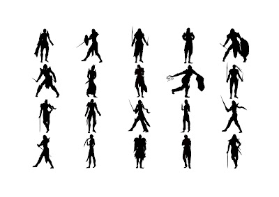
I decided from the beginning that I was only going to do thumbnails of Eleanor. 100 thumbnails for one character is a lot, but when it's a character who we already know is female with armor and actively runs in the game. That's three restraints right away. I have to consider that she would not be overly armoured because she would need maneuverability, but at the same time she is a warrior. Then I have to consider that she is also female and as a silhouette it is important to be able to distinguise her as a female otherwise she might look too masculine.

If I were doing the Villian for example - Domoku. He could be a knight, he could be a samurai character. He might be a mix he might not. There is a lot of room for diverse forms and shapes because he's a villain and isn't bound unlike Eleanor. I chose Eleanor because she was the main character and I wanted to create her first. This sounds like i'm making excuses as to why there's not enough range in my silhouettes. But she's got to be grounded in reality and if she does have armor that's skin tight - you wouldn't see it in a silhouette. That's just the way it is. Now I have to pick some that I like. There are a good few I like so at least I've done some that are good.

Mixing aspects from one thumbnail to another was done often at the later stage 
Erasing sections helped to add more to the characters 
 

Friday, 11 November 2011

Let There Be Light

In this post I am going to look at 3 images (one of which is my own) and analyse the light and how it is used in the image.

Brad Rigney -  A Hostile Takeover
At roughly 3 hours long, the dvd displaying Brad Rigney's process for this piece is incredible. Rigney's understanding of light allows him to create ultra realistic looking images - at the cost of massive amounts of time. There are two light sources in the piece, the main light source - blue tint, and the secondary - the fire bin. The light is coming in from behind the character, possibly slightly to the right. There is a use of diffuse light in respect to the general tone of the image being being blue as light bounces from surface to surface. You can see the points in which the light is at it's strongest on the female centered, with the coat and right side catching the strongest light rays. You can also see the reflected light from the fire onto the large character, and slightly on the left side of the female orc. Very subtle but effective. If i can understand light to a level like Rigneys', I will be to make my painting look more interesting and realistic.

Nate Hallinan - New Best Friends


Again, another brilliant piece. The light is coming from the left, and although it is a snowy landscape you can see the diffused pinky light spread around the image be it on the floor, or robot. The shadows of the trees also gradually fade as the light rays disperse. Even the trees in the distance fade as the moisture mounts up in the distance. There is a secondary light source from the robot, but it is very subtle - only really reflecting of the robot.

Timothy Walmsley - Noob Saibot
I chose one my images to explain thought process when it came to lighting. As you can see, it isn't massively successful and I think this is down to a lack of knowledge in light and painting. My main light source in the Image was at the top right, the Moon. With this is mind I wasn't sure how much of the area would be lit and therefore how much detail I could show of the character. In the end I decided the light would be coming from the right, but my initial lighting left the character so dark you could hardly make out details. I got some helpful criticism telling me to lighten the character up and include some reflected light on his left slide. Because the scene was set in night I wasn't sure how much detail to add and I think I could have still added more and it would have looked fine, but I ran out of time as I had to come back to Uni. There is also a secondary light source which is the torch in the background. It should be a lot brighter and It doesn't have a huge effect on the image and is rather closely spaced towards the shuriken in the foreground. I think In general the image lacks light, and value and I should have probably considered these aspects before beginning the piece.


Tuesday, 1 November 2011

Thumbnails

In the unit we are focusing on the conceptual process for our game ideas. We were initially told before for the design document unit to not go too in depth with out ideas, as having a finalized image in your head will make life hard for you when you struggle to explore other avenues. Although my design for Eleanor was a good start, I knew it wouldn't be final.

Thus the thumbnail process begins. I think we are supposed to do about 80. I can safety say it's going to be a while before I even get to the stage of picking some that are interesting.

First batch, going well

Second batch...starting to run thin on ideas
Third batch, struggling.